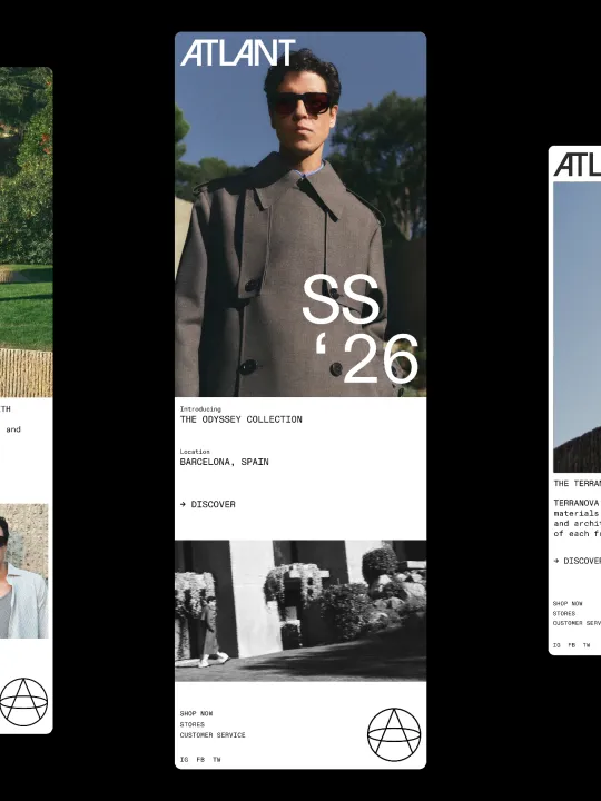
Naming and brand identity for Atlant, a men’s eyewear brand inspired by the spirit of exploration and contemporary sophistication. Conceived from the idea of the atlas and the world of cartography, Atlant embodies a refined vision of travel, discovery and movement, translating these concepts into a distinctive visual language.
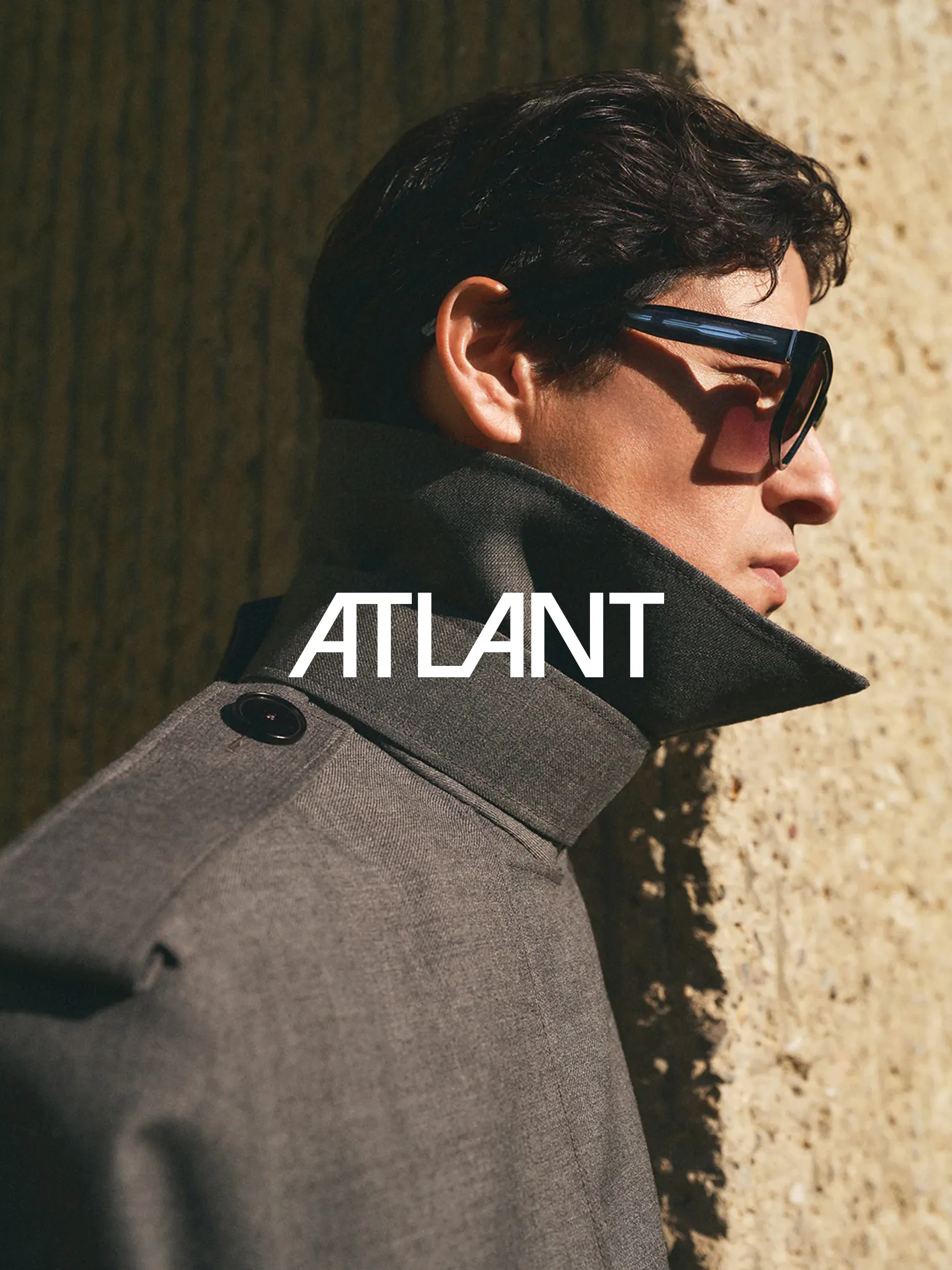
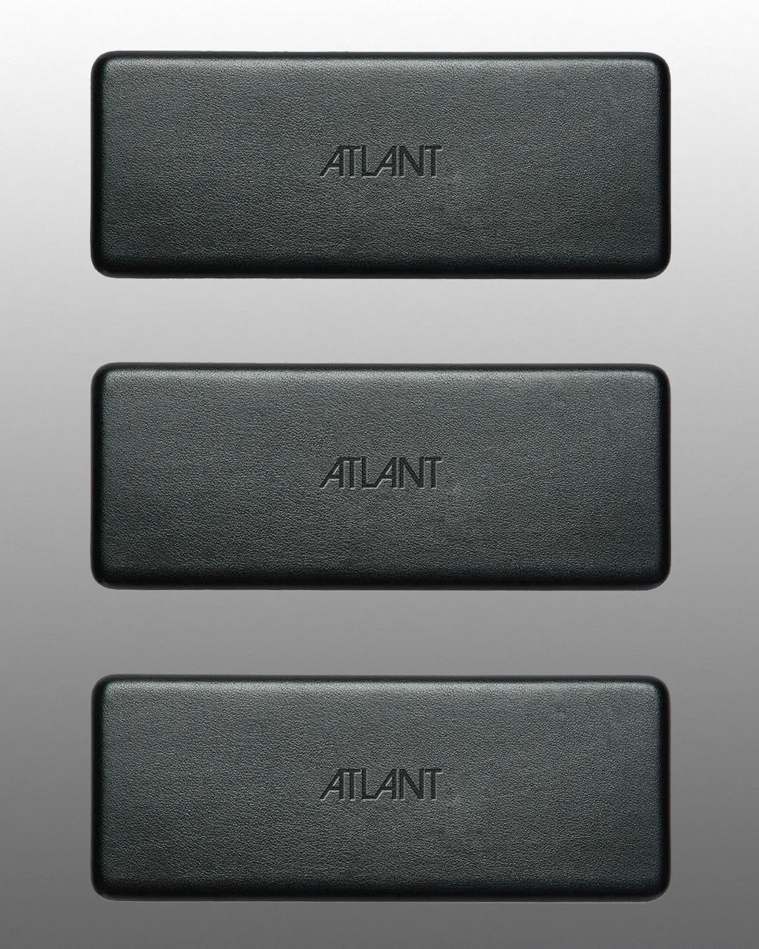
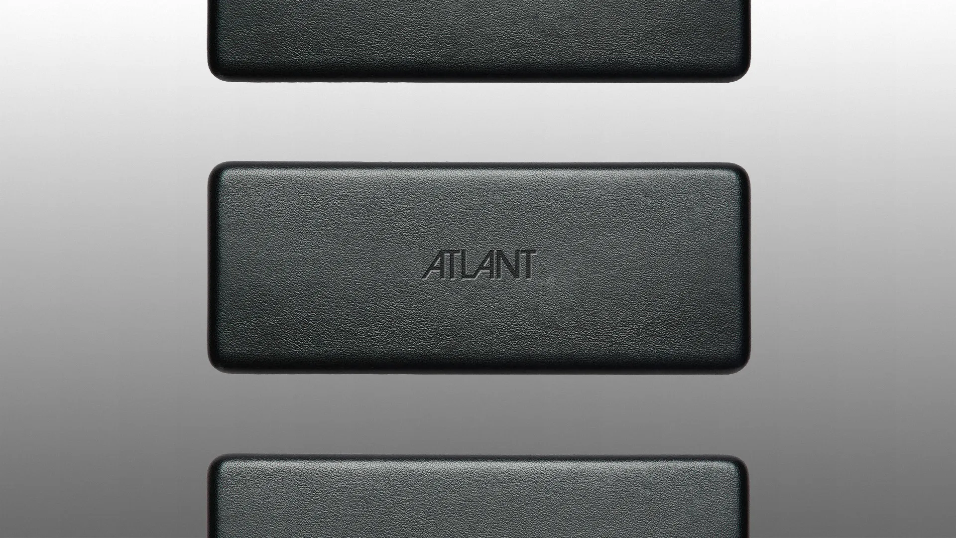
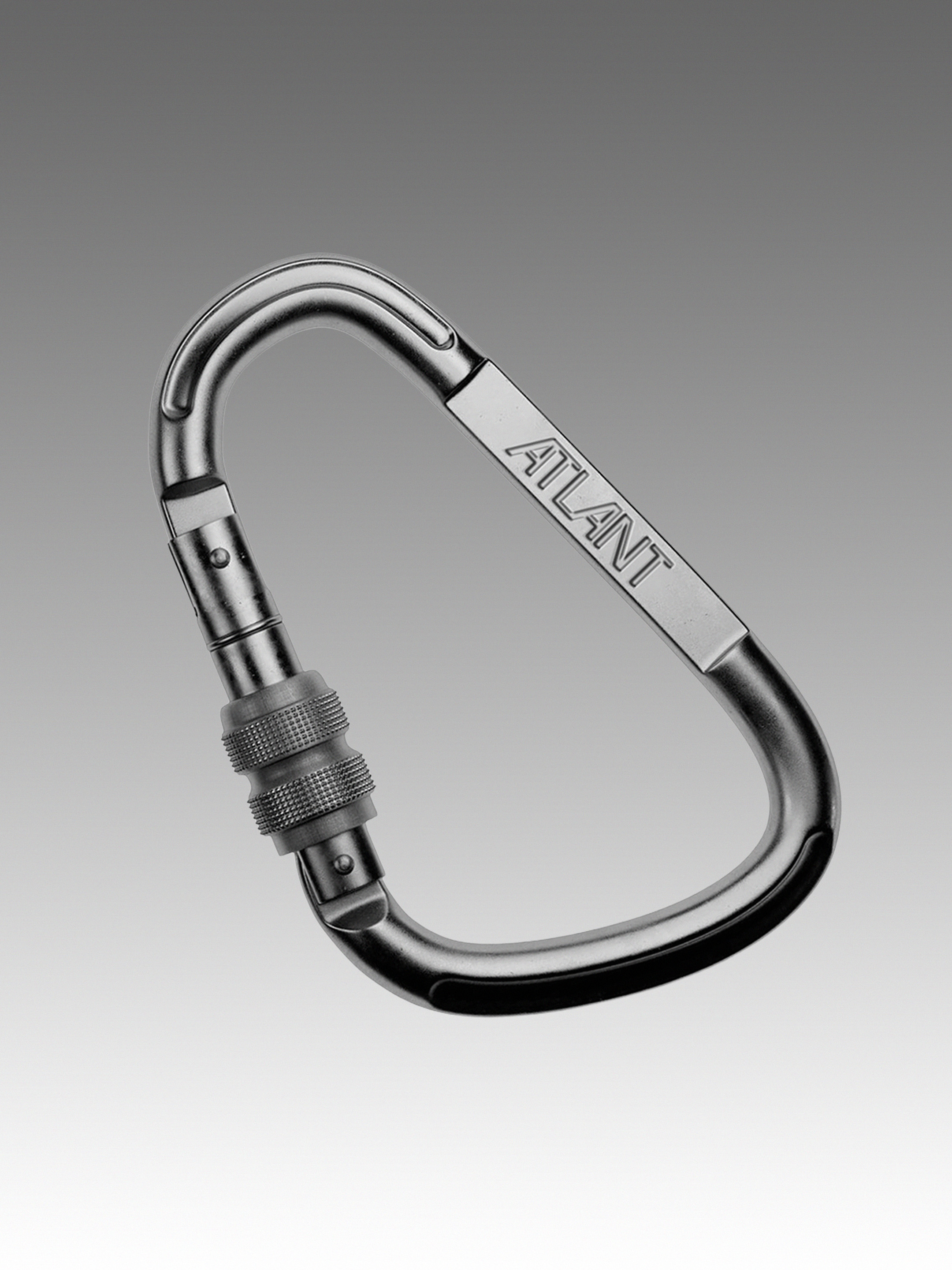
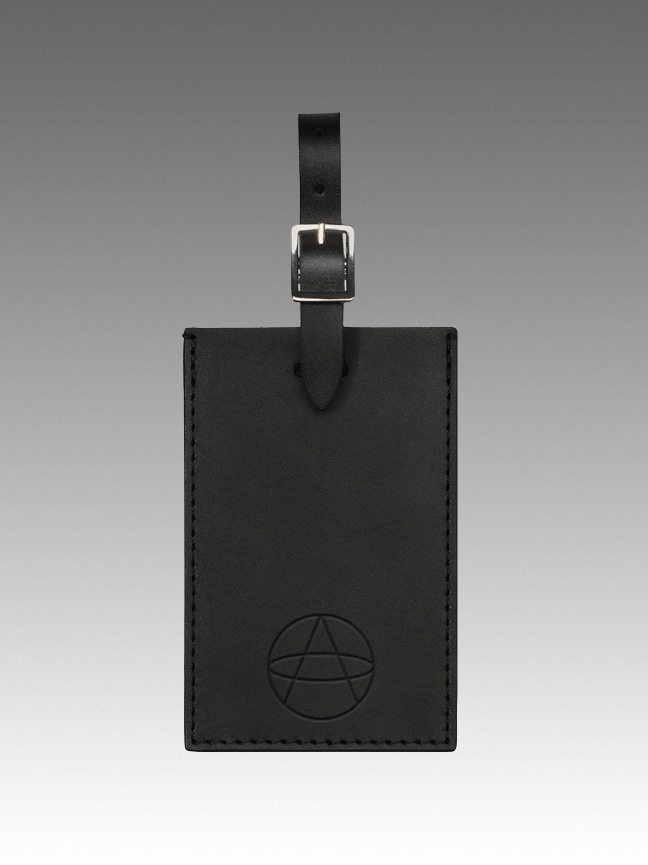
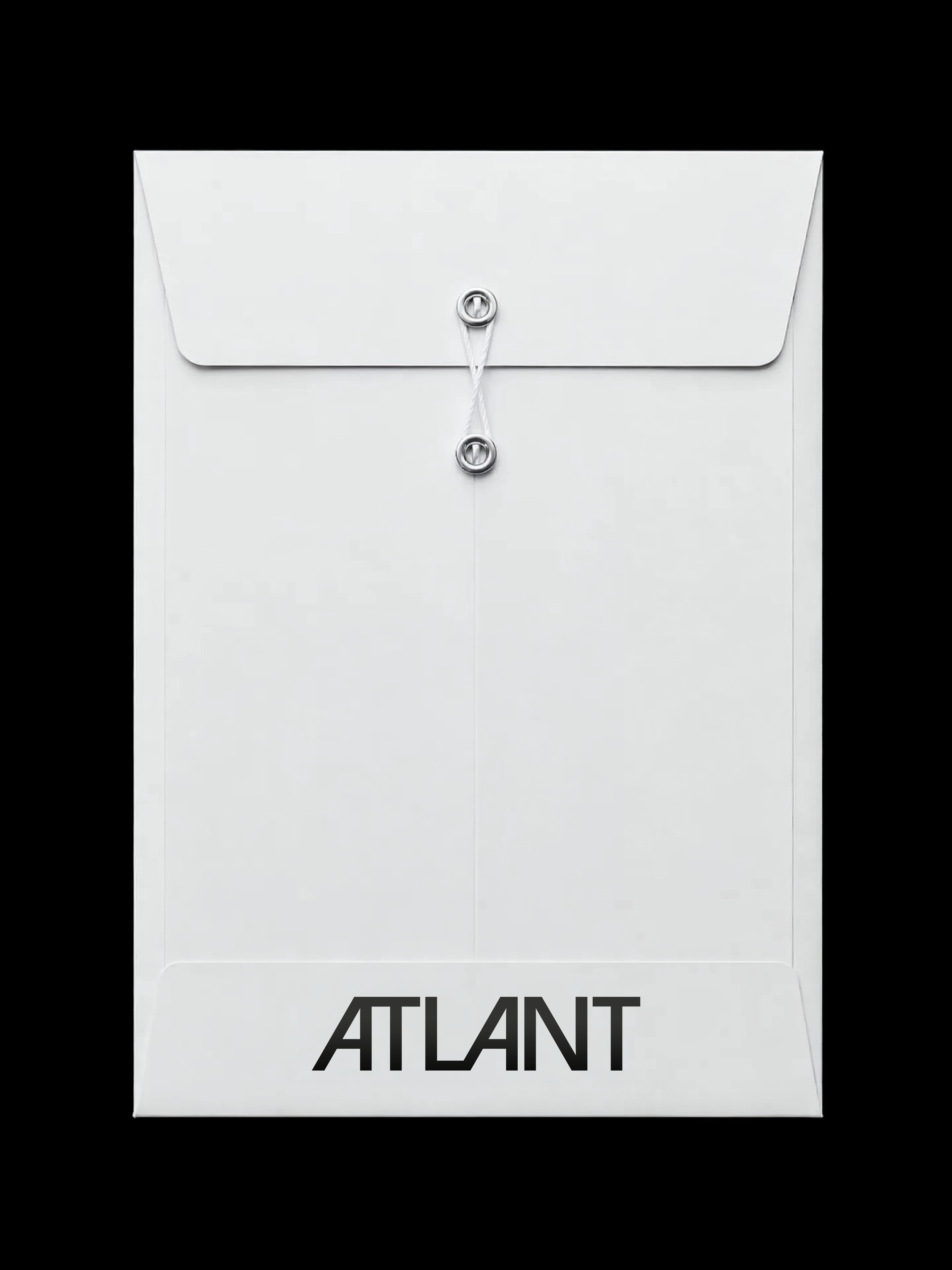
The bespoke name serves as the foundation for the logotype, which draws inspiration from 1970s typography and its distinctive letterforms, particularly the iconic angled treatment of the “A”. The identity is further complemented by a monogram that abstracts meridians and the equator, within which the initial “A” of Atlant is subtly integrated. Its fine stroke and symmetrical construction create a deliberate contrast with the logotype’s more expressive character.
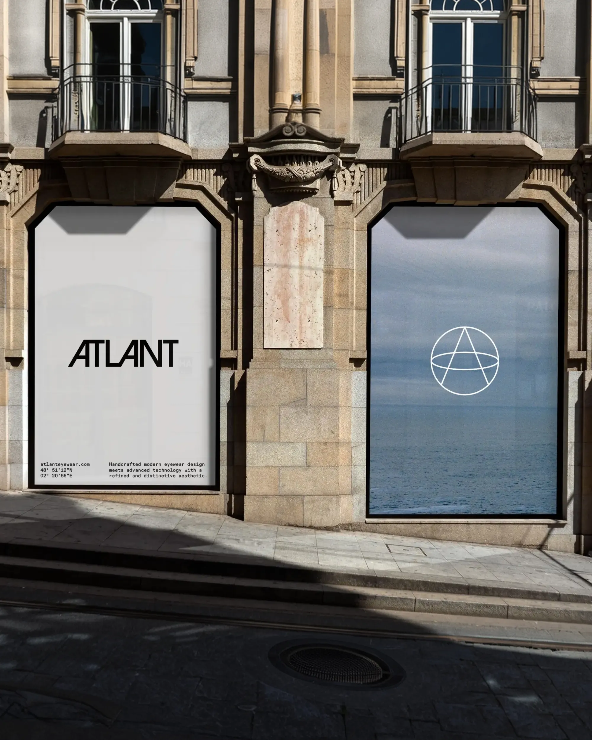
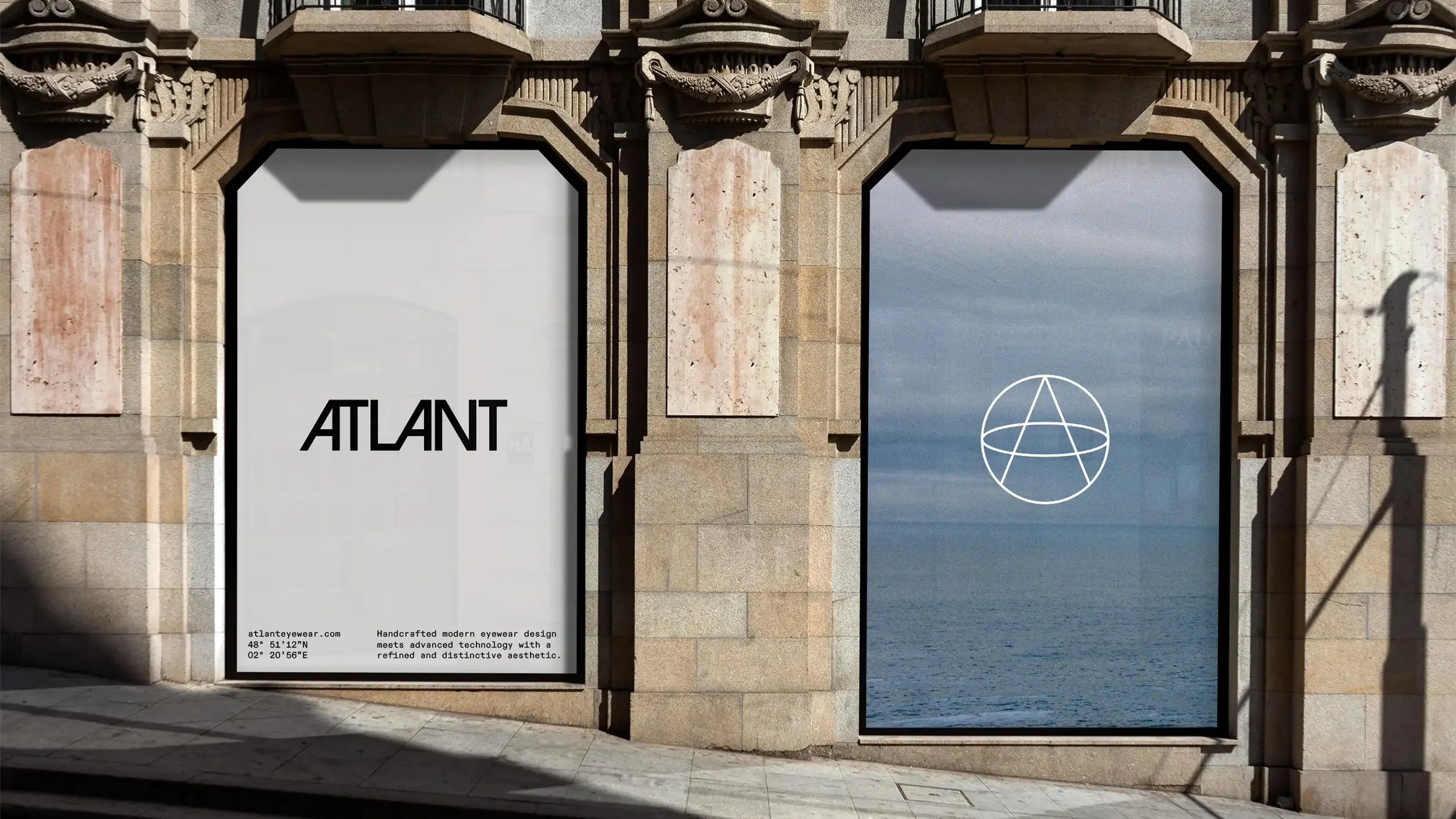
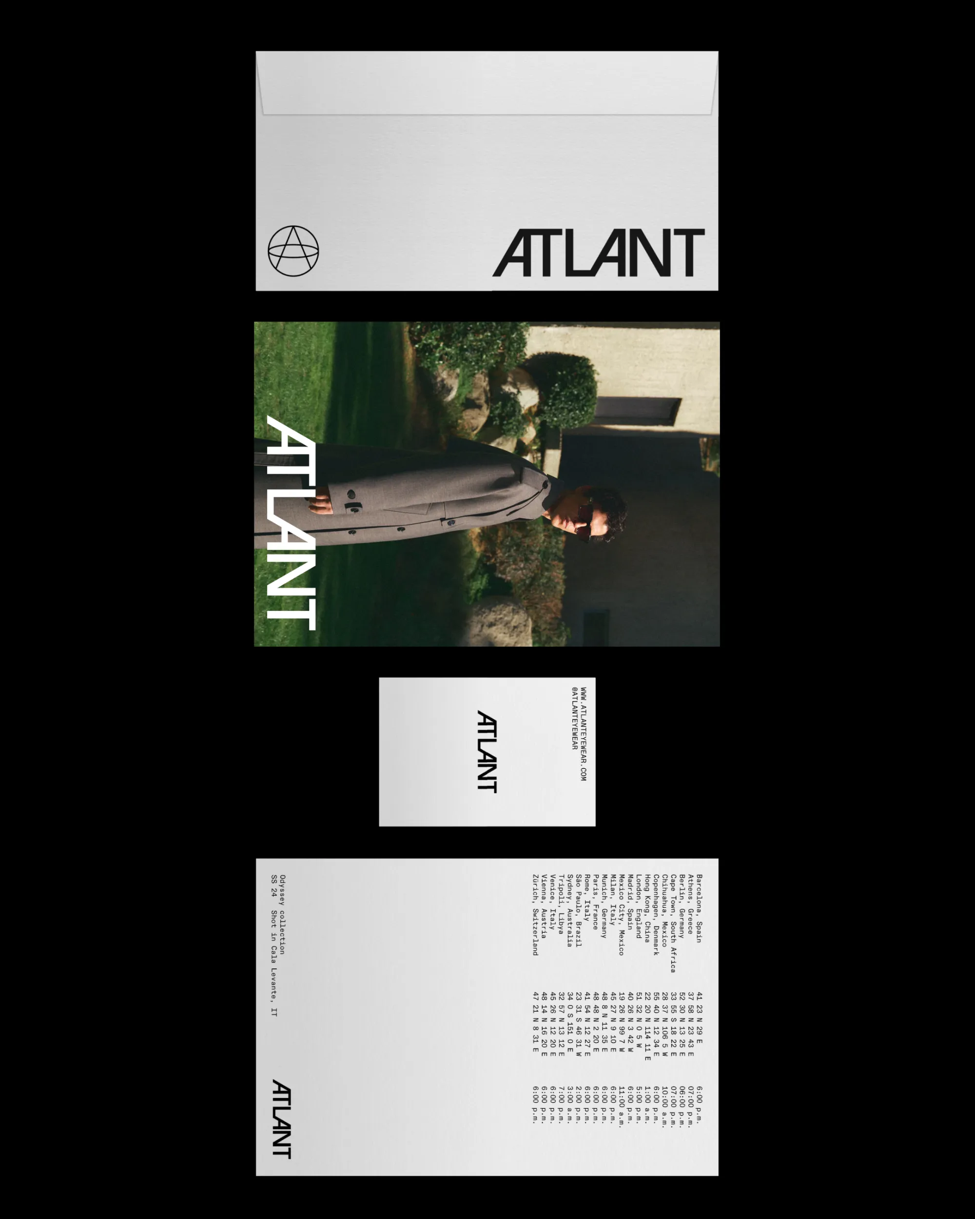
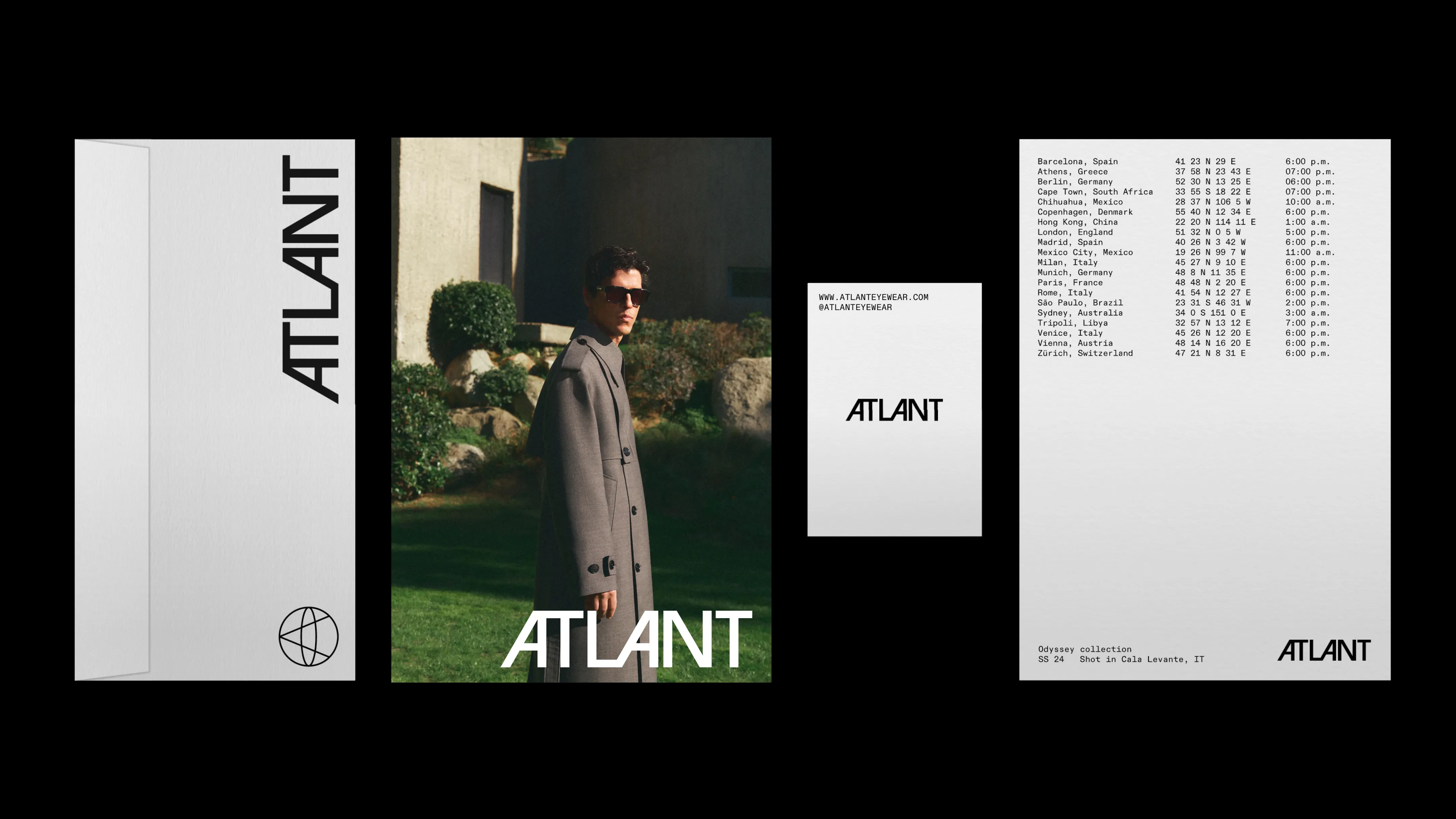
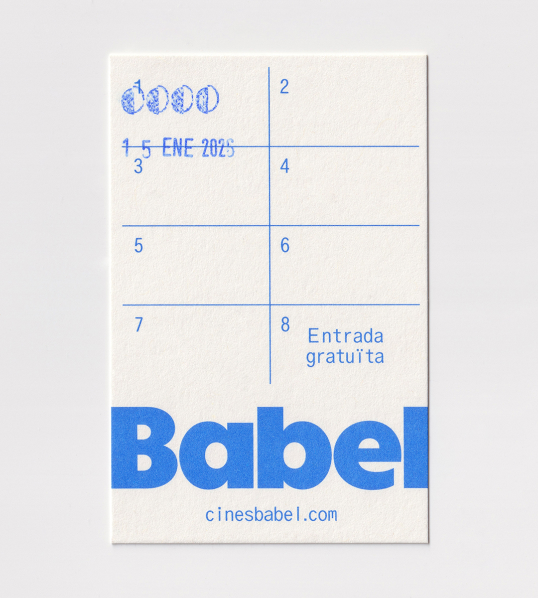
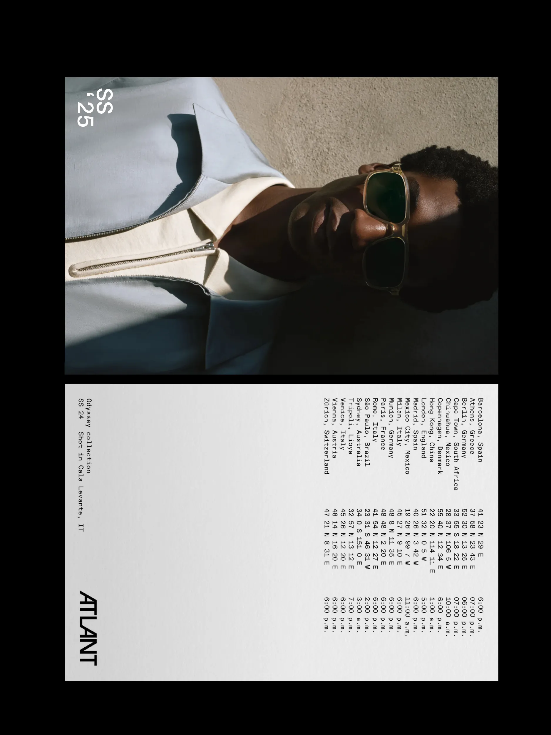
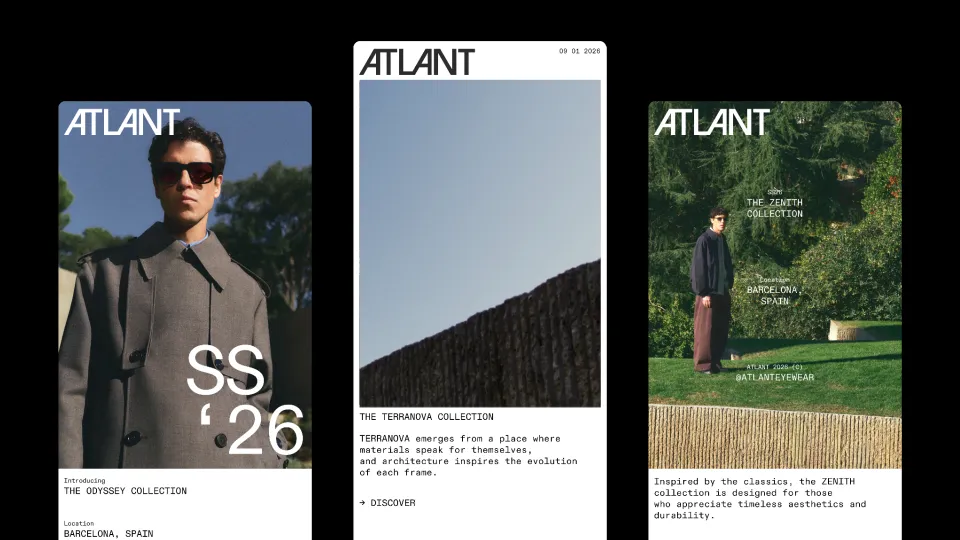
The principal grotesque typeface is paired with it’s monospaced version to reinforce the visual universe of travel, as its construction recalls the typography used in passports or boarding passes, while also evoking a language associated with quality and precision. In addition, physical applications incorporate resources that extend the travel narrative, such as the use of coordinates, repetition of elements in list form, as well as times and dates.
Discover similar projects