The festival’s identity introduces a dynamic typographic treatment that distorts and staggers letterforms, building upon the overarching motif of many coming together. Framing the bold typography is a fluorescent scheme of colour that makes reference to TV signalling errors, test screens, and experimental media aesthetics.
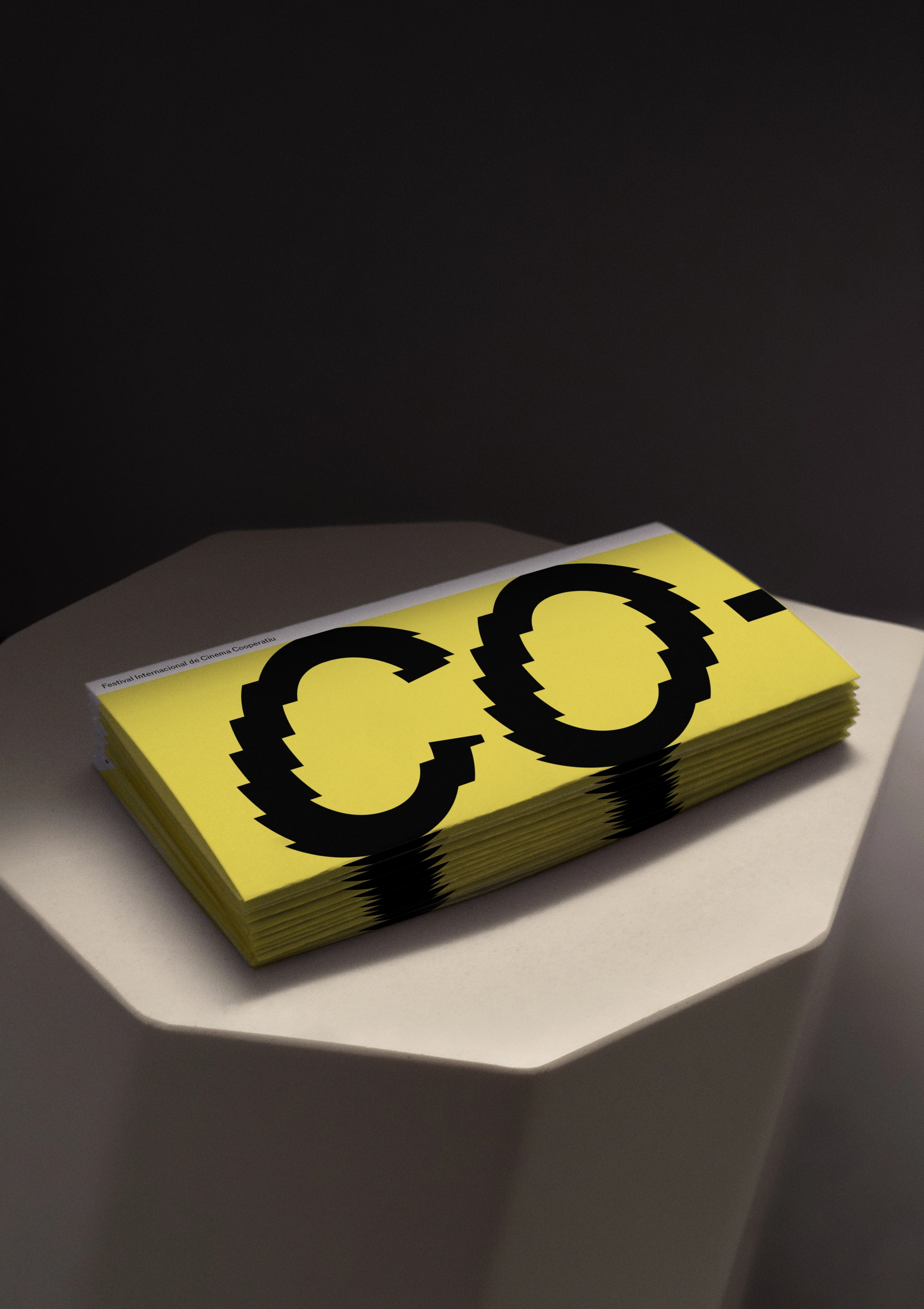
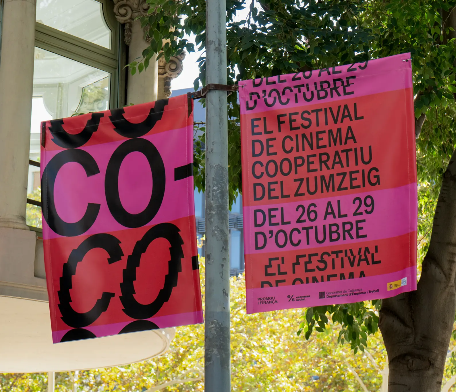

We have developed the visual language of CO- into a cascading web design and other applications for its social media presence, programme ephemera, and wayfinding signage.


Discover similar projects