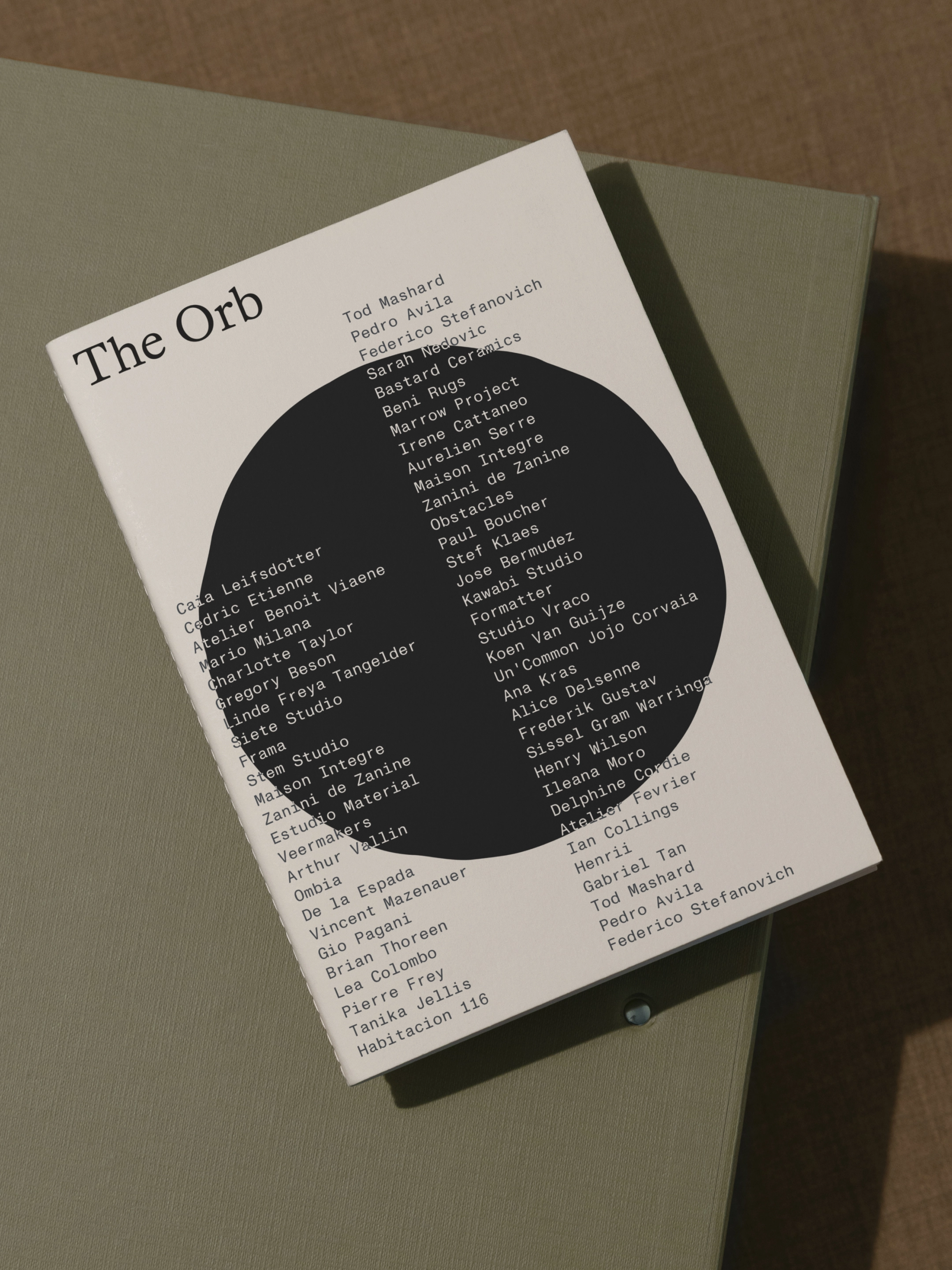
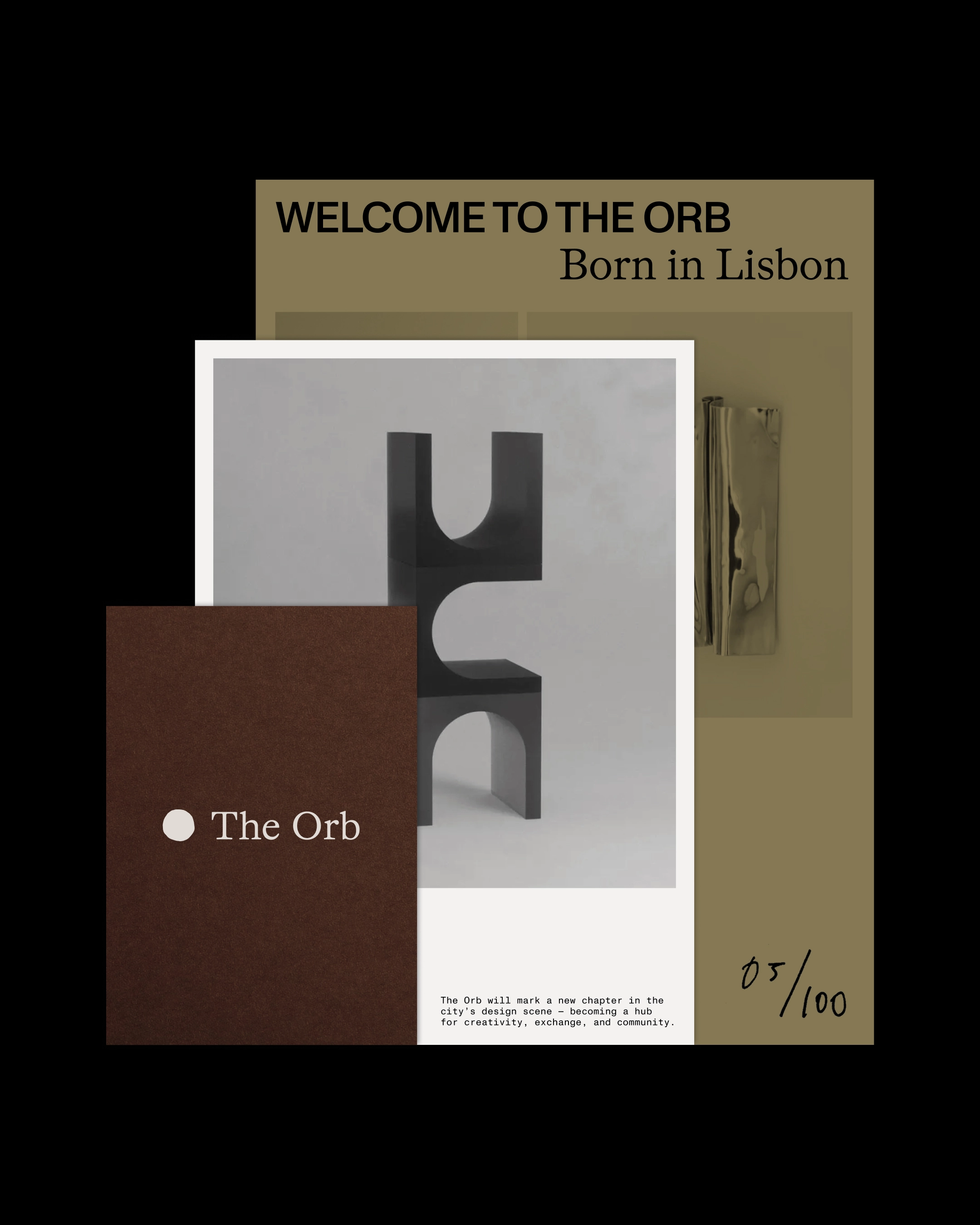
Brand identity for The Orb, a concept space born in Lisbon where collectible design, community and storytelling converge. Existing both physically and digitally, The Orb shifts design from display into dialogue between makers, artists and collectors.
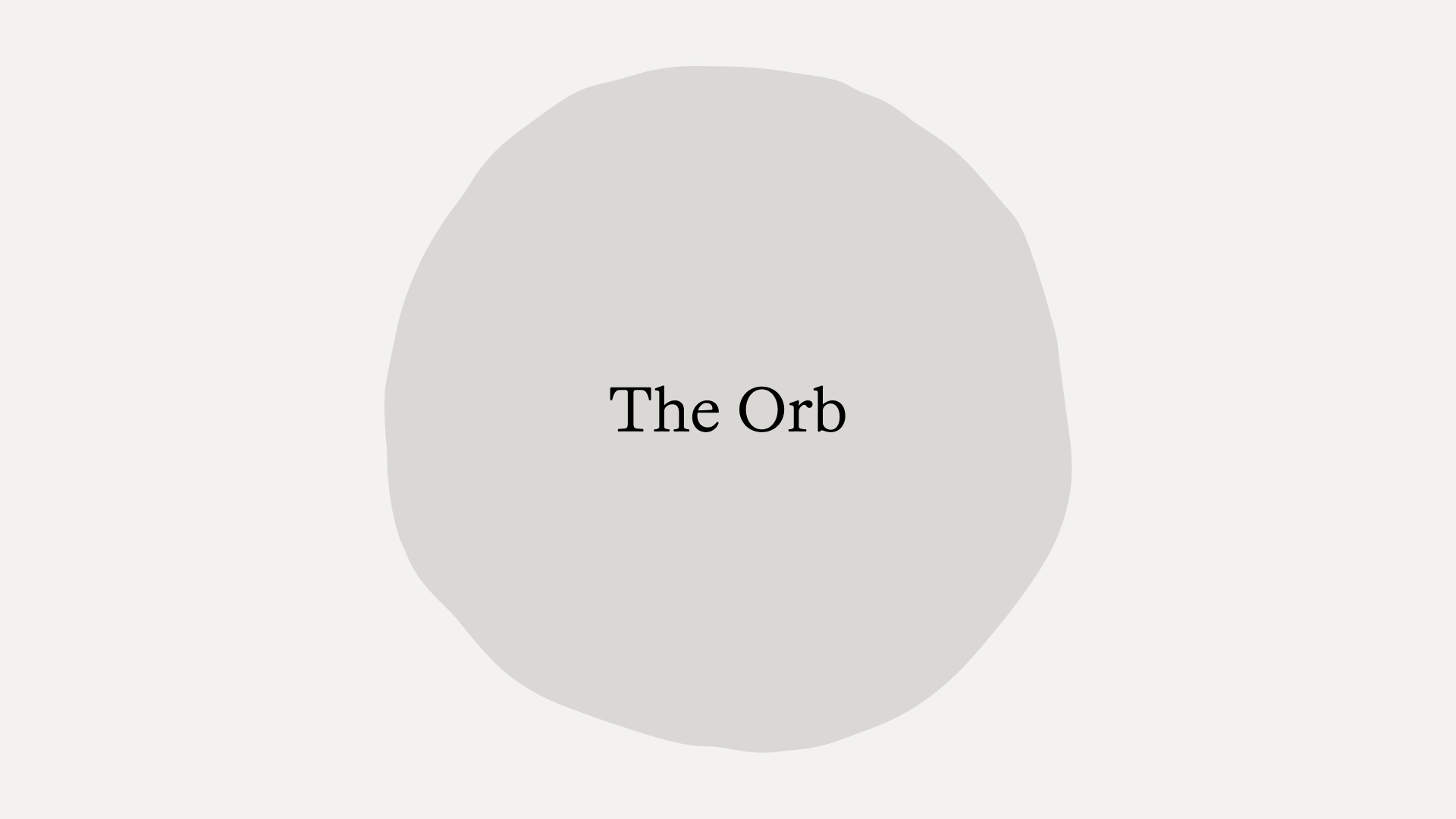
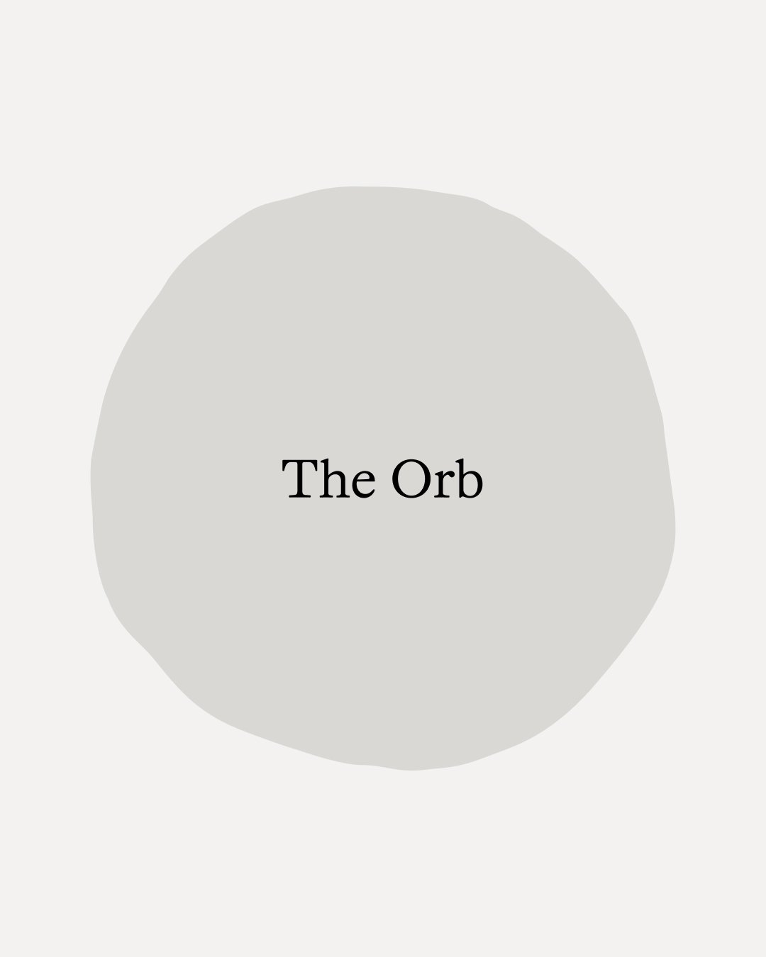
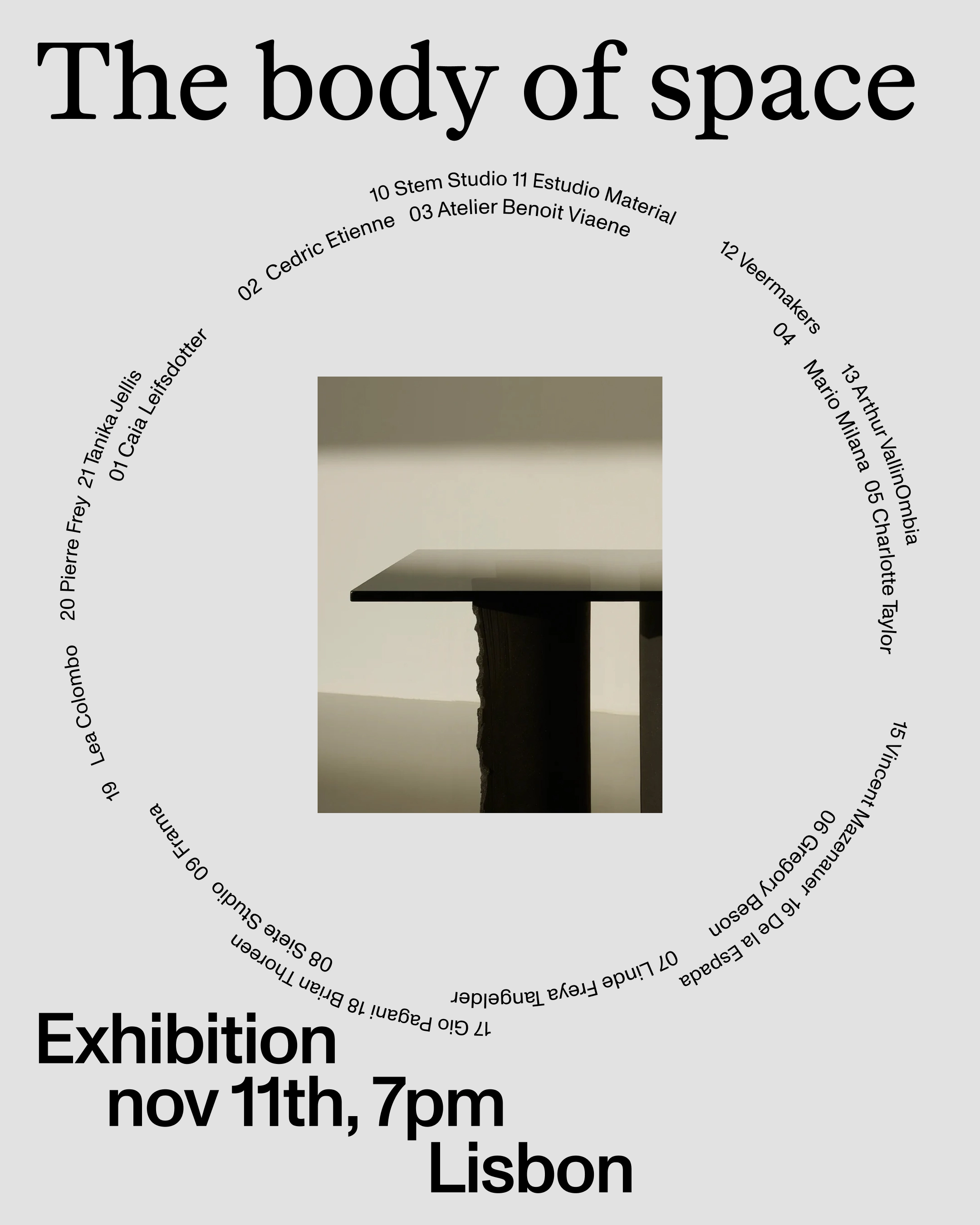
Inspired by the people behind the objects, the identity centres on human connection and creative exchange. An imperfect circular line becomes an artistic representation of The Orb itself and the community that shapes it. The corporate typeface, Otto by Dinamo, draws from 17th-century letterforms, recalling early printed pages and their warm, imperfect ink bleed. This historic sensibility is naturally contrasted with a sharper contemporary secondary font.
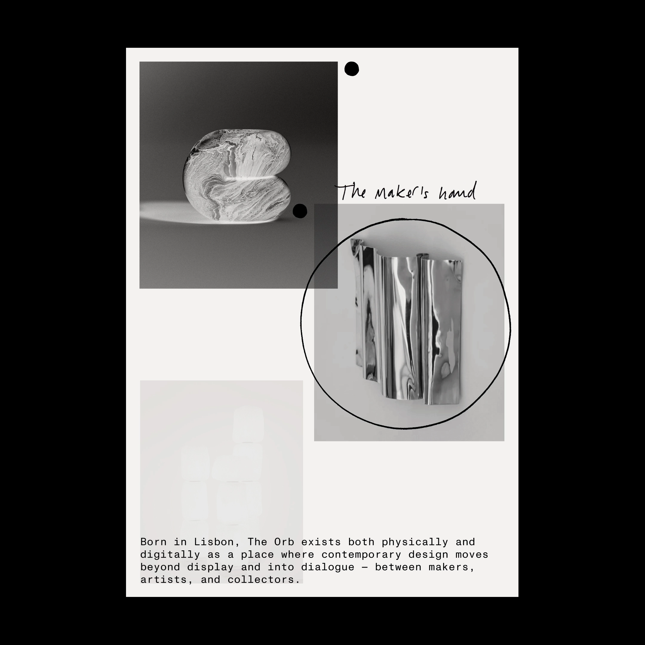
Across physical and digital touchpoints, the identity unfolds through a refined and tactile system. Material choices connect with the artisanal and the human, introducing texture, softness and subtle irregularity to reinforce the sense of closeness and exchange.
Discover similar projects


We edited a series of social media pieces, including three reels, to shape a tone that resonates with The Orb’s audience. Through organic content, these formats translate the brand’s voice into a more immediate and approachable digital presence.